
I have been working on mock-ups of a database health dashboard. The idea is to get a quick glimpse at database health and quickly identify where to start looking for problems. The goal of each design is to contain the same information but present it in the most informative and easily-accessible manner.
This first design contains too much text and doesn’t convey severity as clearly as a more graphical solution.

The second design still needs a few more data elements added. However, it is my favorite so far. The health of each database is communicated much more efficiently with the addition of the bootstrap progress bars with contextual classes added for success, warning and danger. Unfortunately, this design will not scale as well if more than four or five databases are being monitored. It may require a tabbed navigation bar to split out database instances by platform so that each tab can contain four to five databases and tabs will have a visual indicator of severe status issues.
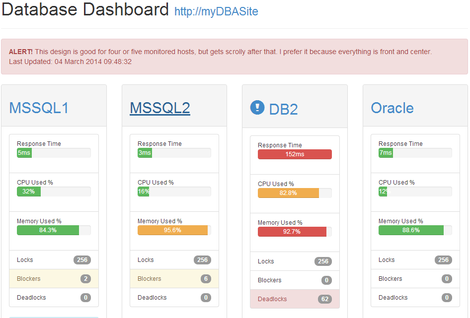
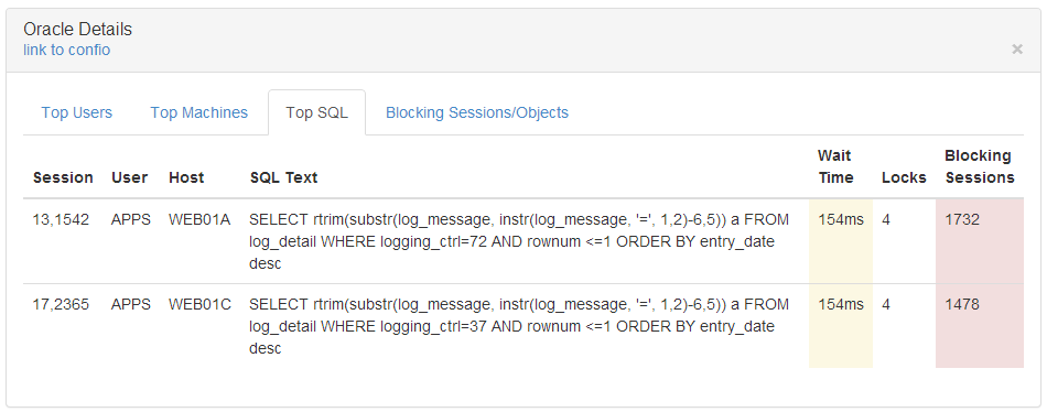
Finally, in both designs, the user can click on a database name to view a collapsible details panel showing more information.
These mock-up designs are available on github at https://github.com/markfennell/bootstrap-db-dashboard.
Leave a Reply
You must be logged in to post a comment.